
[Image above] Credit: Andrew Safonov / Shutterstock
I was maybe 8 years old when the science of color grabbed the attention of my inquisitive young brain. I asked my scientist mom if colors looked different to people with different eye colors, and she explained that it is not eye color but the arrangement of cells in the eye—rods and cones—that receive light and signal the brain.
I have always viewed the world differently from other people, and her answer helped me understand why (at least from the literal visual perspective). But while this answer was perfect for an 8-year-old, it also barely scratches the surface of the factors affecting our color vision.
This blog post will be a wandering adventure that attempts to do for you what my mom did for me 50 years ago: describe in slightly more detail how light becomes color in the eyes of sighted organisms. It will also show that Erwin Schrödinger’s contributions to science involve more than just cats.
The colorful 20s: A quantum shift in light
When we think of Schrödinger, we usually picture that infamous, boxed-up quantum cat, simultaneously dead and alive. But in the 1920s, the Austrian physicist was also obsessed with color. (Relatable.)
He was not alone. The 1920s were the era of quantum mechanics, in which scientists such as Bohr, de Broglie, and Einstein proved that light travels as discrete packets of energy, or photons. This discovery, in turn, changed our understanding of biology.
In 1922, U.S. physiologist Selig Hecht demonstrated that human photoreceptors are so sensitive they respond to just a few individual quanta of light. Color perception was suddenly recognized as chemical switches in the retina being flipped by quantum particles.
Schrödinger wanted to turn this biological reality into a formal, quantifiable space. Because human eyes rely on red-, blue-, and green-sensing cone cells, color perception is inherently three dimensional. Building on 19th-century physics, he published a three-part series in Annalen der Physik in 1920, arguing that color space must be a 3D vector space with a curved, non-Euclidean geometry to reflect how human eyes perceive hue, saturation, and lightness at changing intensities. (That series was only available in German for 50 years until its translation for inclusion in David MacAdam’s 1970 collection of papers called Sources of Color Science.)
Schrödinger’s model was elegant, but it had a flaw: It was mathematically open. His definitions relied on knowing exactly where a color sat in relation to a central neutral axis, i.e., the gradient line of grays running from absolute black to pure white. But Schrödinger never actually defined the neutral axis.
The industrial crisis: Why ‘red’ was not enough
In 1922, the Optical Society of America published its first major report on colorimetry, signaling an urgent industrial need to standardize how color is measured. Because the color space’s foundation was incomplete, color scientists filled the blanks with flat, linear approximations.
Color standardization was not just an academic problem; it was driven by industry. Consumer goods, synthetic textile dyes, inks, and early color film production proliferated along with increased international trade as countries recovered from World War I. However, if a company in New York ordered red dye from Germany, the dye factory would not know if the recipient wanted crimson, or claret, or vermilion. In other words, describing color was entirely subjective.
Part of this subjectivity stemmed from a split in how color behaves in the physical world and the human eye. Dyers, printers, and ceramists work with subtractive color. When you mix physical pigments or oxide glazes, each material subtracts (absorbs) certain wavelengths of light and reflects the rest. Mix the wrong chemical percentages, and your light absorption profile shifts. Conversely, the human eye perceives color as an additive phenomenon, combining the wavelengths striking the retina to build a mental image.
This dichotomy between subtractive and additive color even transformed Hollywood. Early cinema used an additive color creation approach by projecting light through spinning, colored filters. However, the system had several notable drawbacks, including flickering, dim lighting, and it caused eye strain. The breakthrough came when engineers pivoted to subtractive color, embedding cyan and magenta dyes directly onto the physical film strip. By the time Technicolor Process 2 debuted in 1922, a full-on chemical battle was underway to control how materials absorb light.
Yet, this industrial push highlighted a deeper scientific truth: Color does not exist in the material alone. Controlling how a pigment subtracts light wavelengths is meaningless without standardizing how the human brain additively interprets them. To truly conquer color, industry had to move past simple chemistry and begin mapping the biological mechanics of human sight.
The Wright–Guild experiments (1926–1929)
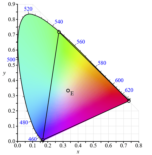
Example of the CIE 1931 color space with RGB primaries and white point. Credit: BenRG, Wikimedia (Public domain)
William David Wright and John Guild independently conducted groundbreaking visual experiments in the late 1920s. They used color-matching apparatuses, asking human subjects to turn dials controlling three primary lights (red, green, and blue) until they perfectly matched a target test color.
The data collected by Wright and Guild was combined by the Commission Internationale de l’Éclairage to create the CIE 1931 color space, the first universal mathematical standard for digital and printed color. The CIE color space anchors systems such as Pantone, RAL, and the Munsell Color System to ensure global supply chains speak the same objective color language, whether that color is in a soil column, printed on a cardboard box, sprayed on a pharmaceutical tablet, displayed on an OLED smartphone, or fired onto a porcelain enamel road sign.
Entering non-Riemannian space
Almost a century later, a research team at Los Alamos National Laboratory (LANL), led by computer scientist Roxana Bujack, has found the missing puzzle piece to complete Schrödinger’s color model.
Traditionally, color science assumed a Riemannian framework, which allows space to be curved but assumes it behaves like flat geometry if you zoom in close enough. However, human vision exhibits diminishing returns: As the difference between two colors grows larger, our ability to gauge that distance scales down.
To capture this behavior, the LANL team pivoted to a non-Riemannian space, where the local geometry cannot be flattened out. By applying this non-Euclidean approach, they successfully calculated the absolute shortest paths—called geodesics—running through color space to establish a mathematically rigorous neutral axis.
This breakthrough successfully corrected two known perceptual anomalies:
- The Bezold-Brücke shift: This optical quirk causes a change in light intensity to subtly shift its perceived hue. Old models treated this quirk as a biological glitch. The LANL team proved that when you chart changing brightness along curved geodesics rather than straight lines, the hue shift is a predictable property of the geometry.
- Perceptual distances: The model accurately accounts for how the brain compresses large color variations, calculating visual distance far more accurately than standard color models such as CIE.
This breakthrough will not change how Pantone and RAL handle their famous color codes, as a specific swatch will still look like that swatch. Instead, it will improve how digital systems handle chromatic adaptation, or the way our brains constantly recalculate what neutral gray looks like when moving a material from harsh factory fluorescents to natural daylight. (If you have ever spent 20 minutes in the light bulb aisle at a hardware store agonizing over “soft,” “bright,” or “daylight,” you know what I mean.)
The benefits of Schrödinger’s color model to the ceramics industry
For an industry focused on advanced imaging, surface optics, and high-performance visualizations, an accurate color model is vital. Whether analyzing complex finite element simulations of high-temperature ceramics or configuring computer-vision systems to detect microscopic defects on a manufacturing line, the way data translates into color matters.
The current common color models create artificial visual boundaries or mask critical transitions simply because the underlying geometry does not align with human physiology. By closing Schrödinger’s mathematical model, the LANL team has given visualization science a way to ensure that what we see on a screen mirrors the data underneath.
It turns out Schrödinger was not just pondering a cat in a box. He was trying to map a critical human sense—and a hundred years later, the geometry has caught up.